

Export Print Ready Files: Sizes 12×16/4×4 & 0.125in Bleed for Designers
Build your artwork at the final print size in inches at 300 DPI, or hand off vector files whenever line work allows it, and add 0.125 inches of bleed for anything printed edge to edge on apparel. Two dimensions cover most jobs: 12×16 inches for a full-front adult tee design, 4×4 inches for a left chest logo. Save vector formats like .AI, .EPS, or .PDF for anything with clean lines or type, and export a transparent 300 DPI PNG when your job is headed to a direct-to-garment printer.
TL;DR:
- Designs should be built at final size in inches with 300 DPI resolution, and at least 0.125 inches of bleed to prevent white edges during trimming.
- Standard print areas are smaller than expected, typically 12×16 inches for full-front adult shirts and 4×4 inches for left chest logos, with variations depending on garment size and style.
- Vector files like .AI, .EPS, or .PDF are essential for line art, while high-resolution PNGs are preferred for photo-style or full-color artwork, with color modes matching printer requirements.
- Proper graphic placement involves specific vertical and horizontal offsets, keeping a minimum of 1 inch clearance from seams and hems, and scaling designs proportionally across sizes.
- Ordering from companies that produce pre-made designs or handle file preparation can simplify the process, but always verify print dimensions, bleed, and file formatting before finalizing.
Table of Contents
- Print Area Cheat Sheet for Apparel Sizing
- How Do You Position Graphics on a Garment?
- What Files Should You Export for Print?
- How Much Bleed Do You Need?
- Does Printing Method Change Your File Setup?
- Where This Guide Comes From
- A Practitioner’s Take on Print Sizing
- Skip the File Prep, Order the Finished Print
- Sources
- FAQ
Print Area Cheat Sheet for Apparel Sizing
Every printer’s template looks slightly different, but the industry has settled on a fairly consistent set of dimensions for standard placements. These numbers give you a starting artboard size before you ever open the printer’s own spec sheet.
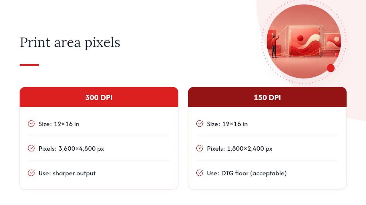
Standard apparel print areas run smaller than people expect, especially on youth and toddler sizes, and the pixel math always follows the same rule: multiply your inches by your DPI. At 300 DPI, a 12×16 inch design becomes a 3,600×4,800 pixel file. Drop to 150 DPI, the accepted floor for DTG printing, and that same design only needs 1,800×2,400 pixels, though sharper output always favors the higher number.
Treat these as starting points, not gospel. Printful’s placement documentation shows some products now support printable areas as large as 15×18 inches, and hoodies often need their own adjusted maximum because of the front pocket. All-over prints and oversized designs behave differently too since they wrap around seams and cuffs, which means the flat rectangle math above stops applying once a design leaves the torso panel. Always pull the exact template from your printer before locking your artboard.
How Do You Position Graphics on a Garment?
Placement mistakes ruin more designs than bad resolution does. A print that’s technically sharp but sitting too high, too low, or too wide on the shirt still looks like an amateur job when it arrives.
- Vertical drop: Center chest and full-front designs typically sit 2 to 4 inches below the collar seam, depending on garment style and neckline depth.
- Left chest offset: Position left chest logos roughly 3 to 4 inches from the shirt’s center line and about 2 to 3 inches below the shoulder seam.
- Seam and hem clearance: Keep at least 1 inch of clearance from side seams and the bottom hem so the print isn’t distorted by press tolerance or fabric stretch.
- Proportional scaling: Full-front designs generally look best at 60 to 70 percent of the garment’s chest width, a ratio worth checking against your own sizing as you size up.
- Sizing across the run: A design that reads perfectly on a medium can look cramped or oversized on an XL or 3XL unless you scale the artwork up proportionally with the garment.
- Hoodie adjustment: Raise front designs about 0.5 inches higher than you would on a standard tee to clear the pocket seam, and cap full-front width around 11.5 inches on most pullover styles.
- Sleeves and tanks: Long sleeve placements need extra clearance near the cuff seam, and tank top designs should account for narrower shoulder straps cutting into a standard chest layout.
What Files Should You Export for Print?
Vector and raster files aren’t interchangeable, and picking the wrong one is one of the fastest ways to get a file bounced back by a printer. Vector formats like .AI, .EPS, and .PDF store your artwork as mathematical paths rather than pixels, so a logo or line of type scales cleanly from a business card to a billboard with zero quality loss. Raster formats like PNG store fixed pixel grids, which means resolution is locked the moment you export.
The math behind sizing raster art is simple: pixels equal inches multiplied by DPI. A 12×16-inch full-front design at 300 DPI needs to be exactly 3,600×4,800 pixels, not close, not rounded down.
Color mode matters just as much as resolution. Most DTG shops work in sRGB or standard RGB, while screen printers frequently ask for Pantone or CMYK spot color breakdowns since each color gets its own screen. Outline your fonts before export so text doesn’t reflow or substitute on the printer’s end, and always save DTG-bound art as a transparent PNG rather than one with a white background baked in.
- Organize layers and group by placement (front, back, sleeve) before exporting anything.
- Name files clearly, including the placement and intended print dimensions (e.g.,
logo_frontchest_4x4in_300dpi.png). - Include a short placement note or mockup image so the printer knows exactly where the art goes.
- Export a separate file for each placement rather than one flattened composite.
- Double check color mode and embedded profile match what your printer requests.
Pro Tip: Zoom to 100 percent before you export anything. On-screen previews at “fit to window” hide jagged edges, compression artifacts, and soft focus that only show up once the file is actually printed.
How Much Bleed Do You Need?
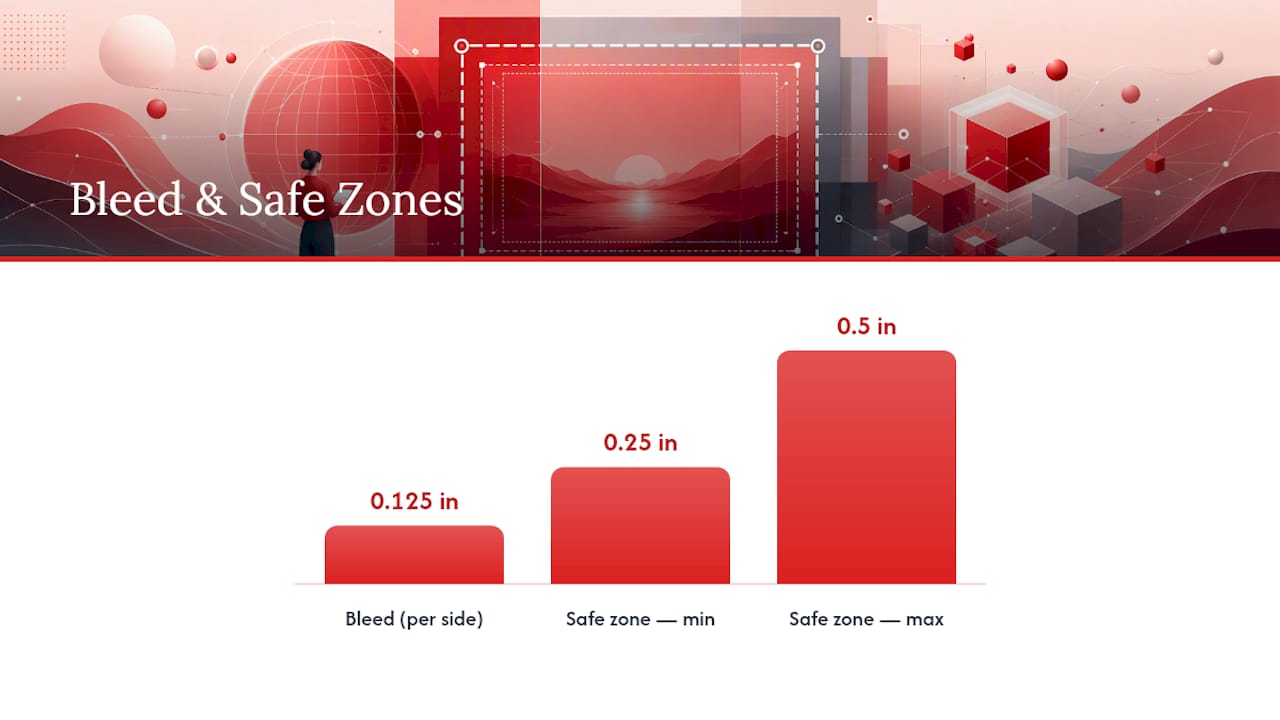
Bleed is the extra artwork that extends past your trim line so the final cut never exposes bare fabric or paper. Trim marks the actual finished edge, and the safe zone is the buffer inside that edge where your important text or logo elements should live.
The University of Georgia’s design glossary explains it plainly: skip bleed, and you risk a thin white sliver appearing along the trimmed edge once the design shifts even slightly during production. A U.S. practical standard for apparel is 0.125 inches of bleed per side.
- Extend background colors and edge-to-edge graphics 0.125 inches beyond your trim line on every side.
- Keep critical text or logo elements at least 0.25 to 0.5 inches inside the trim line, inside the safe zone.
- Check your bleed guides are visible before exporting; most design software adds them automatically once you set bleed in the document setup.
Missing bleed is one of the most common and entirely preventable print errors, and it’s also one of the cheapest to fix before you ever hit export.
Does Printing Method Change Your File Setup?
Your printing method decides your color limits, your file format, and even how fine your detail can be, so it’s worth locking in before you finalize artwork.
- DTG (direct-to-garment): Handles full-color gradients and photo-realistic art well. Send a 300 DPI transparent PNG at final print size.
- Screen printing: Favors vector files with spot color separations since each color runs through its own screen; more colors mean more setup cost, so simpler palettes print cheaper and cleaner.
- Heat transfer: Works from either vector or high-res raster art, but adds a visible layer to the fabric, so heavy full-coverage designs can feel stiff compared to DTG or screen print.
- Embroidery: Requires simplified artwork with minimal fine detail. Small text and thin lines tend to blur together once stitched, so bump up text size or remove it entirely for embroidered placements.
When in doubt, ask your printer which format and color mode they prefer before you build the final file. It saves a round of revisions.
Where This Guide Comes From
This guide draws on hands-on production experience from Nicholas at McLaren Tee Hub, covering the same sizing and quality questions independent designers run into daily. For deeper dives, see the graphic tee sizing guide, the hoodie size guide, and judging print-on-demand quality.
A Practitioner’s Take on Print Sizing
Three rules save more headaches than any spec sheet: build at final size, never scaled up later; always pull the actual printer template before exporting; and mock up your file at 100 percent zoom before you call it done.
The most common failure is upscaling a small raster file instead of rebuilding it in vector. Second is ignoring seam allowance, which crowds prints right up against a hem that was never going to tolerate it. Third is undersized sleeve text that reads fine on screen and disappears once it’s actually stitched or pressed.
Order a physical proof before a full run. A screen mockup lies about scale in ways paper never does.
— Nicholas
Skip the File Prep, Order the Finished Print
Pop culture apparel and gifts are often built to size and bleed standards to ensure sharp, correctly placed prints without requiring you to open a design file yourself. If you’d rather wear the art than export it, browse a piece like the Pulp Fiction inspired tee or the Facehugger coffee mug for a look at how these specs translate onto finished goods.
Prefer the made-to-order route entirely? Read how made to order merch works, then visit Mclarenteehub to browse the full catalog and place an order.
Sources
Adobe’s paper size guide covers the theory behind print dimensions and resolution. Printful’s placement guide shows real printer template variance. For method-specific tradeoffs, the screen print versus embroidery comparison from The Precious Lamb is worth a read before choosing a production method.
- There will be bleed — and other design terms you should know | University of Georgia
- T-shirt design placement guide | Printful
FAQ
What DPI should I use for print designs?
Use 300 DPI at final print size for sharp results; 150 DPI is an accepted minimum for DTG printing but produces noticeably softer detail.
What size should a full-front t-shirt design be?
A standard adult full-front design runs about 12×16 inches, though youth and toddler sizes require smaller artboards closer to 9×12 and 7×8 inches.
How much bleed do I need for apparel printing?
Add 0.125 inches of bleed per side, following the standard U.S. print recommendation, to avoid white slivers along trimmed edges.
Should I use vector or raster files for print?
Use vector formats like .AI, .EPS, or .PDF for logos, type, and line art since they scale without quality loss; use high-resolution raster PNGs for full-color, photo-style designs.
Can Mclarenteehub print my design without me formatting the file myself?
Some companies handle the print-ready file prep on their product catalogs, letting you order finished merch without doing the DPI and bleed math yourself.